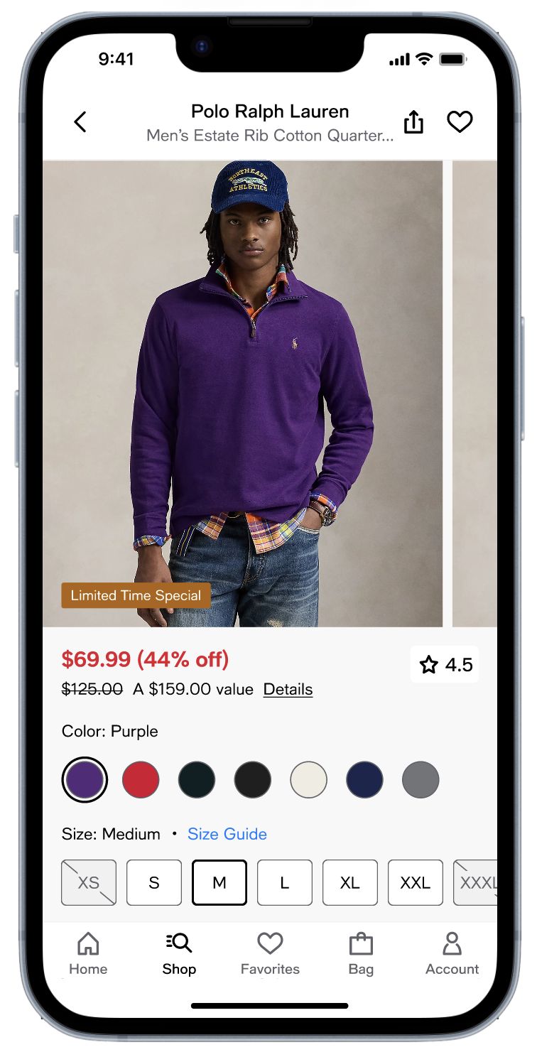
Product detail page

Web & app / Macy’s & Bloomingdale’s

A redesigned product page simplified how customers find critical information and understand product value.

Problem

Customers struggled to quickly determine whether a product was worth buying. Important information was often incomplete, buried, or difficult to scan.

This uncertainty created friction in the purchase decision and contributed to abandonment.

“This uncertainty created friction”

Customer insight

Customers rely on a small set of signals when deciding whether to buy.

These signals include

  • product imagery
  • price and promotions
  • ratings
  • color and size availability
  • shipping options.

If these signals are not immediately visible, customers hesitate.

Design strategy

  1. Optimize the landing view - Important elements should be visible immediately.
  2. Reduce cognitive load - Clear hierarchy makes information easier to scan and understand.
  3. Move closer to simplicity - Multiple simple actions are better than a single complex one.
  4. Eliminate dead ends - Ensure there is always a clear and compelling next action to take.
  5. Interaction is king - how a product feels matters.

Exploration

We explored several interaction models to improve clarity and decision-making.

#1 - Dynamic CTA

An experiential approach that guides the customer step-by-step on the way to adding an item to their cart.

#2 - Focused Selection

A focused selection mode that removes distractions when choosing variants.

#3 - Tabs

A tabbed layout that reduces vertical scrolling and surfaces additional product information on demand.

Outcome

The redesign centers on the landing experience, placing the most important purchase signals immediately within reach.

Secondary information is structured into clean, scannable sections that encourage exploration without overwhelming the interface.

The result is a focused, confident path to purchase.

“The result is a focused, confident path to purchase”

+0.9%

Add-to-bag rate

+0.5%

Revenue per visit

+0.3%

Conversion rate

Revenue per visit increased thanks to a bump in conversion and rise in average order value.

Before image

Before

After image

After

Product detail page

Lead designer / Web & app / Macy’s & Bloomingdale’s

A redesigned product detail page simplified how customers find critical information and understand product value.

Problem

Customers struggled to quickly determine whether a product was worth buying. Important information was often incomplete, buried, or difficult to scan.

This uncertainty created friction in the purchase decision and contributed to abandonment.

“This uncertainty created friction...”

Customer insight

Customers rely on a small set of signals when deciding whether to buy.

These signals include

  • product imagery
  • price and promotions
  • ratings
  • color and size availability
  • shipping options.

If these signals are not immediately visible, customers hesitate.

Design strategy

  1. Optimize the landing view - The most important decision-making elements should be visible immediately.
  2. Reduce cognitive load - Clear hierarchy makes information easier to scan and understand.
  3. Move closer to simplicity - Multiple simple actions are better than a single complex one.
  4. Eliminate dead ends - Ensure there is always a clear and compelling next action to take.
  5. Interaction is king - how a product feels matters.

Exploration

We explored several interaction models to improve clarity and decision-making.

#1 - Dynamic CTA

An experiential approach that guides the customer step-by-step on the way to adding an item to their cart.

#2 - Focused Selection

A focused selection mode that removes distractions when choosing variants.

#3 - Tabs

A tabbed layout that reduces vertical scrolling and surfaces additional product information on demand.

Outcome

The redesign centers on the landing experience, placing the most important purchase signals immediately within reach.

Secondary information is structured into clean, scannable sections that encourage exploration without overwhelming the interface.

The result is a focused, confident path to purchase.

“The result is a focused, confident path to purchase”

+0.9%

Add-to-bag rate

+0.5%

Revenue per visit

+0.3%

Conversion rate

Revenue per visit increased thanks to a bump in conversion and rise in average order value.

Before image

Before

After image

After