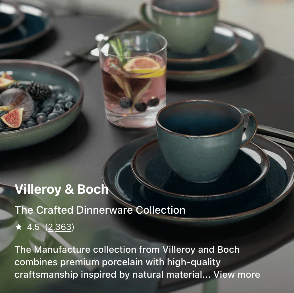
Shop the collection

Lead designer / Web & app / Macy’s

Reimagined collection shopping by turning a fragmented experience into an intuitive multi-item purchase flow.

The problem

Macy’s “master pages” used a traditional PDP template to display product collections. The page appeared to represent a single product, but it actually contained multiple individual items.

This mismatch frequently confused customers and made collections difficult to shop.

Product insight

Customers browsing curated collections are usually assembling complementary items, not buying a single product.

Yet the experience forced them to navigate between multiple PDPs and add items one by one.

“This revealed an opportunity to design for multi-product shopping”

Design strategy

We redesigned the page into a dedicated collection shopping interface optimized for multi-product selection.

The experience balances clarity, efficiency, and product connection—helping customers quickly understand the collection and build coordinated sets.

The experience

The page introduces the collection through editorial context and styled imagery that shows the products together.

Demo of the carousel experience

Each item appears as a shoppable card where customers can configure sizes, colors, and quantities directly within the page.

A persistent summary bar updates as items are selected, allowing customers to add the entire collection to bag in one step.

Outcome

The redesign transforms master pages into a true collection shopping experience.

Customers can now understand collections instantly, browse efficiently, and build coordinated sets from one place.

By aligning the experience with how customers actually shop, purchasing multiple items becomes intuitive.

“Purchasing multiple items becomes intuitive.”

Shop the collection

Lead designer / Web & app / Macy’s

Reimagined collection shopping by turning a fragmented experience into an intuitive multi-item purchase flow.

The problem

Macy’s “master pages” used a traditional PDP template to display product collections. The page appeared to represent a single product, but it actually contained multiple individual items.

This mismatch frequently confused customers and made collections difficult to shop.

Product insight

Customers browsing curated collections are usually assembling complementary items, not buying a single product.

Yet the experience forced them to navigate between multiple PDPs and add items one by one. This revealed an opportunity to design for multi-product shopping.

“This revealed an opportunity to design for multi-product shopping”

Design strategy

We redesigned the page into a dedicated collection shopping interface optimized for multi-product selection.

The experience balances clarity, efficiency, and product connection—helping customers quickly understand the collection and build coordinated sets.

The experience

The page introduces the collection through editorial context and styled imagery that shows the products together.

Each item appears as a shoppable card where customers can configure sizes, colors, and quantities directly within the page.

A persistent summary bar updates as items are selected, allowing customers to add the entire collection to bag in one step.

Outcome

The redesign transforms master pages into a true collection shopping experience.

Customers can now understand collections instantly, browse efficiently, and build coordinated sets from one place.

By aligning the experience with how customers actually shop, purchasing multiple items becomes intuitive.

“Purchasing multiple items becomes intuitive”