Mobile App ——— 2020
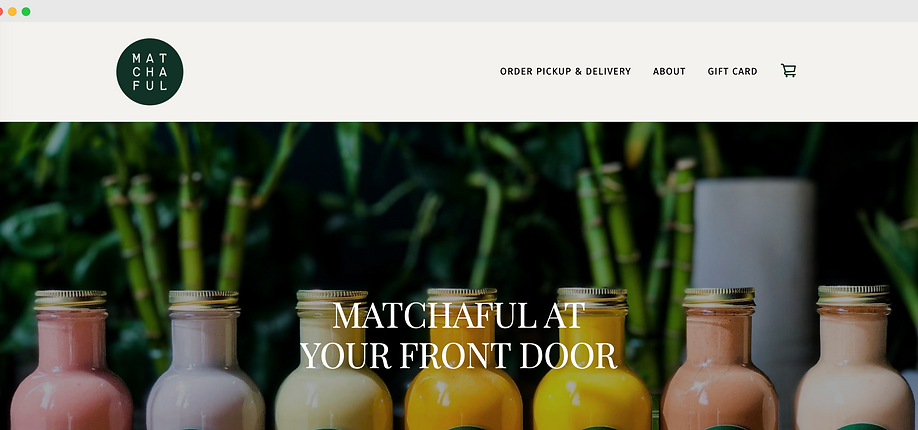
Cha Cha Matcha
Summary
Cha Cha Matcha is a contemporary café that offers a variety of matcha drinks, matcha powder, and other delightful products such as pastries and ice cream. The company has developed a substantial following of matcha enthusiasts, many of whom visit the stores regularly to enjoy their daily caffeine fix. I was responsible for implementing the visual design of their new mobile app.
Role
UX/UI Design
User Testing
Brand
Cha Cha Matcha


The Problem
Cha Cha Matcha customers can only purchase fresh drinks in person. This may not be ideal for someone who has little time, little patience, or wants to avoid paying high delivery fees on services like Uber Eats or Seamless. Cha Cha’s demographic is young, tech-savvy, and usually in a hurry—but right now, its ordering process is outdated, and it's losing money to lower-quality competitors like Starbucks.
The Solution
A mobile app that allows customers to customize and place orders ahead of time for pickup in-store. The app allows users to pay for the order using a credit card or Apple Pay via their mobile device and alerts them when the order is ready for pickup. This saves customers time and makes it easier than ever to get their matcha.

The Process
Scope
-
Run a design sprint to produce an MVP
-
Complete the user interface and visual design
-
Apply intuitive micro-interactions
Constraints
-
Branding guidelines have already been established
-
Timeline of one week for completion
-
Zero budget for user testing meant being resourceful in gathering participants
Personas
Our personas included busy, young men and women ages 21-35 who were interested in matcha and had a knack for trends and social media. Through our assumptions and limited demographic and psychographic research, we were able to define three main personas we felt would embody our primary users.


Comparative Analysis
A comparative analysis of visual design was conducted between leading competitors in the direct-to-consumer matcha industry.
Competitive Analysis
A SWOT analysis revealed the strengths, weaknesses, opportunities, and threats of a Cha Cha Matcha mobile app against potential apps for leading competitors.


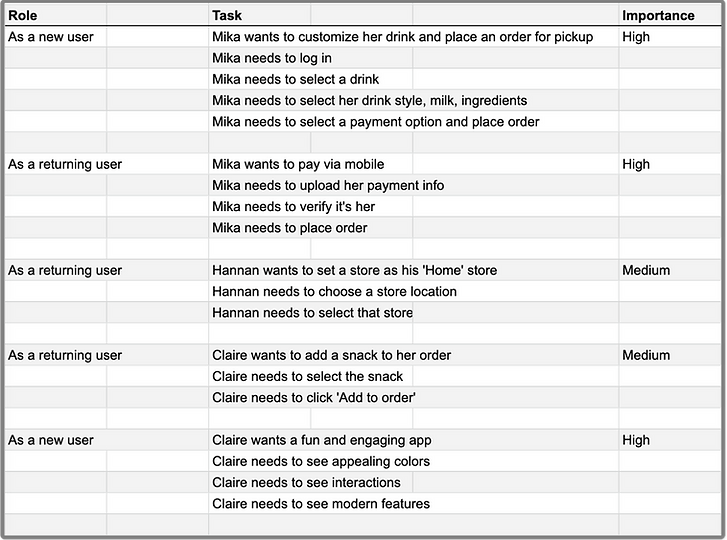
User Stories
By writing user stories, we are able to tap into the psychology of our users and better understand what their needs ultimately look like.
We created a spreadsheet with possible tasks that users could complete within the app and labeling them in terms of importance. This would help guide our design process and keep us focused on the most important tasks.
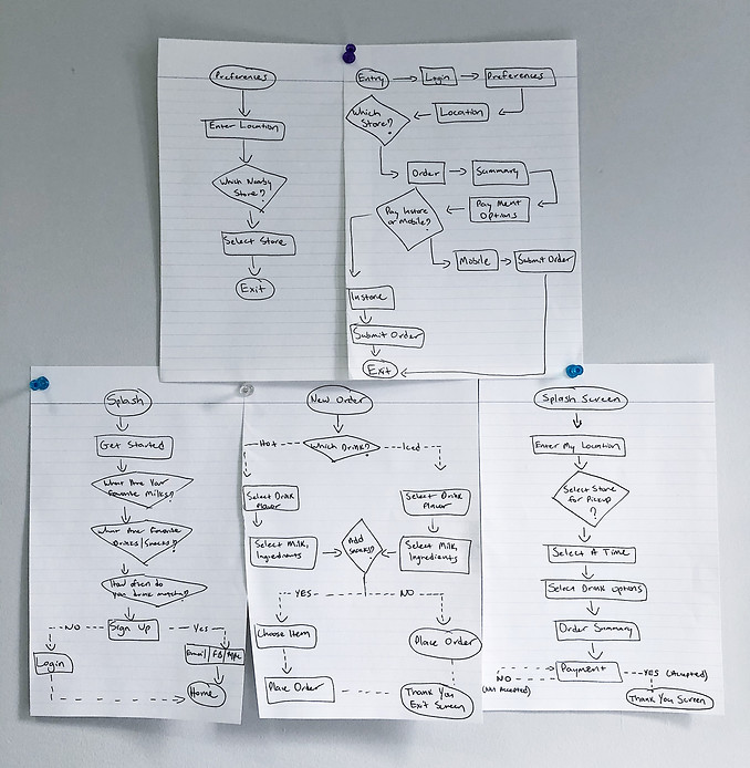
User Flows
As the design process progresses, it becomes less abstract and more visual. We sketched user flows in order to map these pathways and better visualize our users’ experience through the app.
Site Map
A sitemap is an important step in the user-centered design process as it ensures content is placed where users would expect to find it. It can also be used as a reference point for wireframes.
By laying out a sitemap, we were able to illustrate how the pages would be prioritized, linked, and labeled.

Sketching
Exploring, ideating, and refining potential solutions.


Wireframes
Now that we better understand our users, we can begin designing a structure for the app. The wireframes below contain our content strategy and will serve as the blueprint for the final design.

Branding & Styling
Cha Cha has achieved success and celebrity endorsements partly due to the fact that its branding is not constrained to the traditional Japanese box that most matcha companies find themselves in.
Cha Cha breaks out of that box by drawing influence from South American jazz and minimalist Scandinavian design. The pink and green colors combined with fun leafy patterns quickly transport you to Miami’s Ocean Drive.
This approach in branding is what has solidified the brand as a mainstay on all things social media and blogs—so, I needed to make certain that this same brand identity would translate over to a mobile app.
Color Scheme
The Cha Cha Matcha brand colors consist mainly of a pink and green complementary color scheme. Four unique color gradients help round it out and add a stronger visual appeal.
Incorporating these colors appropriately into the app would be of high importance, otherwise, we risk abandoning existing loyalists.

Typography
Cha Cha Matcha incorporates a wide array of typefaces in its branding and communications.
From variations of modern typefaces such as Fakt Pro and Druk Super to Cha Cha's own 'CHA CHA SCRIPT,' designed by Virgil Abloh himself.

Illustrations and Graphics
Having a younger user base comes with certain expectations for the digital products they interact with. Our users expect the app to be engaging, delightful, and fun.
Further, studies show that users are more likely to forgive an error or failure in an app if the overall experience is delightful.
That said, I decided on a strategy of implementing fun brand assets throughout the app, where appropriate, in hopes of creating a unique and highly engaging user experience.
A few of these assets are shown below.

Whew! That was a lot.
I promise we're almost at the finish line!
You've gotten this far, so, by now I assume you're at least somewhat interested in all of this UX stuff I'm throwing at you! Sorry, not sorry.
So far we've covered the problem, solution, process, and branding guidelines for a newly designed Cha Cha Matcha app.
But before we get into user tests and design iterations, I wanted to give your head a break from the technicalities and demonstrate how the things we've covered so far have manifested themselves into usable designs.
Mika
If you recall, Mika's primary need was an easy way to customize her drinks.
We demonstrate that here.


Hannan
Hannan's primary need was an easy way to set a 'Home' store location.
We demonstrate that here.
Claire
Claire's primary need was fast payment via Apple Pay.
We demonstrate that here.

And now, let's get back on track.

User Testing
Once a prototype was designed we moved into the testing phase.
User testing was an important step as it allowed us to test our design assumptions and catch usability errors and broken flows in real-time.
We tested six users, each of whom performed a set of tasks designed to test the overall usability of the app and the effectiveness of its visual design direction. Here are what some users had to say:


Usability Measure
Four out of the six users we tested left feedback regarding the app's overall usability. Of the four, only one had difficulty completing tasks on the app.

Design Iterations
After gathering insight from user testing, we iterated our designs to reflect the needs and behaviors of our users. Key design changes are illustrated below.
1.
The original information architecture was outlined so that important information fell into three distinct categories: Home, Order, and Profile. However, the bottom navigation was found to overshadow the main purpose of the app—to place an order.
Iteration: We decided to utilize a hamburger menu on the top left, which is not only standard for this type of app but frees up the bottom navigation bar for our main CTA—saving users an extra click.

After

2.
At first, content cards were designed with a white background to ensure maximum color contrast. However, after an early round of user testing, we found that users expressed dislike for the white content card, stating that it disrupted the harmony of the visual design direction they had come to expect with Cha Cha.
Iteration: We implemented a strong gradient to the background using a darker shade of the existing brand colors.

3.
The cart icon changes states once an item has been added to the bag—indicating to the user that it may be time to checkout. However, that wasn't enough for some users. We decided we needed to make it clearer and easier to begin the checkout process.
Iteration: We added a sticky button at the bottom of the screen that is permanently displayed even when scrolling. This button changes color states when an item is added to the bag, giving users an added visual cue.

After

Conclusion
Outcomes
-
Designed a mobile app that allows users to purchase products on-the-go for pickup at the location of their choice
-
Applied Cha Cha Matcha’s brand style and guidelines to the visual design
-
Added micro interactions where applicable to create a more pleasant and engaging user experience
Lessons
-
Applying existing brand guidelines to a new product has its own particular set of challenges, especially when also balancing mobile UX/UI guidelines and best practices
-
Testing designs early on is invaluable as the results can inform future important design decisions
-
Referring to personas and user flows at every stage helps keep designs focused and on target
Recommendations for Cha Cha Matcha 2.0
-
Add geolocation and map feature to display the nearest stores directionally
-
Incorporate consistent product imagery across all product categories for a more balanced visual design
-
A/B test a different gradient pattern on content cards to see which is more effective in drawing clicks