Mobile App ——— 2020
Localeyez
Summary
LocalEyez recommends local events and experiences based on your interests. The app utilizes innovative machine-learning technology that leverages the user's current inputs, personal profile, and past events to enhance the personalized experience.
Role
UX/UI Design
User Testing


The Problem
Localeyez needs to create a mobile interface that can be scaled, consistent, and aesthetically pleasing. It must incorporate personalized machine learning, interactivity, and animation to connect with its customers and make the designs both more functional and more fun.

The Process
Key Business Requirements
-
How can users find activities to go to?
-
How can users be more engaged with the app?
-
How can users feel they have control over what they see on the app?
Scope
-
Run a design sprint to produce an MVP
-
Complete the user interface and implement visual design
-
Implement features for personalization and machine learning
Constraints
-
Time: Localeyez had a one week turnaround time for completion
-
Budget: Zero budget was allocated toward user research which meant being resourceful in crafting materials and in participant selection
Audience
-
Age: 21-50 years old
-
Annual income: $30,000 - $120,000
-
Location: Large, urban areas in the United States
-
Interests: Food tours, bar crawls, trivia nights, parties, sports, family-friendly, concerts, hikes
-
Attitudes: Optimistic, social, spontaneous
-
Challenges: Social isolation due to urban culture, lack of time, lack of organization
Personas
Through our assumptions and limited demographic and psychographic research, we were able to define two main personas that we felt would embody our primary users.


Comparative Analysis
A comparative analysis was conducted to analyze best practices for machine learning-based user interfaces on mobile devices.

Competitive Analysis
A SWOT analysis revealed the strengths, weaknesses, opportunities, and threats between leading apps that utilize machine learning.

SWOT Key Findings
-
Most brand personality is held in the navigation and CTA's
-
The organization of content cards allows for flexibility in the information architecture
-
Experiences become more engaging when interactions are applied
User Flows
As the design process progresses, things become less abstract and more visual. Through the use of user flows we were able to map these pathways and better visualize our users’ experience.


Site Map
A sitemap is an important step in the user centered design process as they ensure content is placed where users would expect to find it. They can also be used as a reference point for wireframes.
By laying out a sitemap, we were able to illustrate how the pages would be prioritized, linked, and labeled.

Sketching
Exploring, ideating, and refining potential solutions.


Wireframes
Now that we better understand our users we can begin designing a structure for the app. I designed wireframes to serve as the blueprint for the final design. The wireframes will contain the content strategy for our application.

Branding & Styling
Colors
We applied a primary color scheme because primary colors provide versatility while maintaining harmony. If used correctly, these colors will appeal to both of our personas.
.png)
Moodboard
Creating a mood board allowed us to collect thoughts, ideas, color schemes, and moods in one place to define a coherent design concept without the risk of losing sight of the bigger picture.
Logo

Iterations of the logo led us to a final design.
User Testing
Once our prototype was designed, we moved into the testing phase.
User testing was an important step as it allowed us to test our design assumptions and catch usability errors and broken flows in real-time.
We tested six users whom each performed seven specific tasks.
These tasks are described below:
-
Search for an event
-
Add filters to a search
-
Search by category for 'Outdoor & Adventure'
-
RSVP to a skiing event
-
Edit profile
-
Save a category
-
Log out

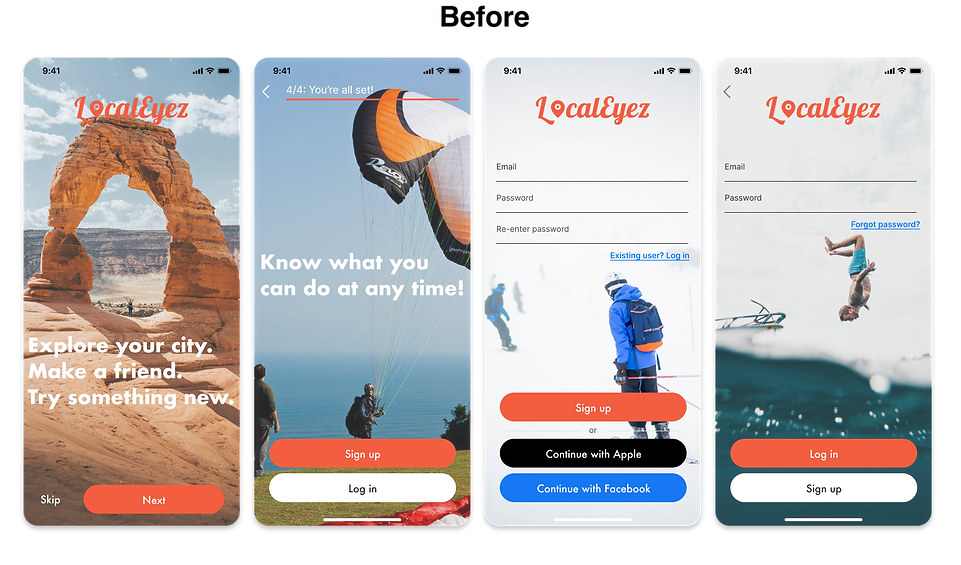
Design Iterations
After six rounds of user testing, we compiled the data and iterated our designs to reflect the needs and behaviors of our users. Key design changes are illustrated below.
1.
A majority of users navigated to the Search screen when asked to add a filter to their search.
Iteration: Add the filter dropdown menus in the Search screen where users expected to find them.

2.
Most of the users navigated to the Search screen when asked to save an activity category.
Iteration: Add a Heart icon to the Search screen to more closely match our users' expectations.

3.
The 'History' tab on the Profile screen was not clear to several users. Many confused it with being their search history.
Iteration: Change the word 'History' to 'My Events'

4.
The hero images were not reflective of urban areas which happened to be the demographic of our users.
Iteration: Replace current images with ones that reflect the demographic of our users as well as activities contained in the app.

Conclusion
Outcomes
-
After extensive prototyping and testing we understand our users’ needs, goals, and motivations
-
Achieved a working MVP for a personalized events app
Lessons
-
Referring to our established personas helps keep all design decisions focused
-
User testing is vital at every step of the design process because they test our assumptions as designers
-
Adhering to common UX Design practices and trends helps ensure that users have an easy time navigating our product
Recommendations for Localeyez 2.0
-
Conduct further tests on the 'Saved' and 'Notifications' screens to find areas of improvement
-
A/B test all micro-interactions and validate them through user data
-
Incorporate original imagery and icons for personality and brand presence