


The Problem
Working professionals need an easy, time-efficient way of completing home improvement projects as they often work long hours and lack the time required for the process of finding a trustworthy, dependable, and affordable contractor to meet their home improvement needs.
The Solution
Enter Biddy, the "eBay" for homeowners and contractors.
Biddy is a mobile app that brings together homeowners and contractors yet eliminates the need for face to face interaction.
The app allows users to post listings of home improvement projects they wish to undergo and have contractors bid on them in real-time using a competitive bidding model.
Biddy saves users precious time to focus on what really matters.

The Process

Key Business Requirements
-
Users should be able to post project plans including photos
-
Design a user-friendly interface for launch
-
Implement features for competitive bidding
Scope
-
Run a design sprint to produce an MVP
-
Complete the user interface for launch
-
Implement features for listing projects and competitive bidding
Constraints
-
Time: Biddy 1.0 had a two week turnaround time for completion
-
Budget: Zero budget was allocated toward user research which meant being resourceful in crafting materials and in participant selection
Audience
Since we were conducting a rapid design sprint, we did not survey users.
We conducted brief research on homeowners and contractors in the United States and worked under the assumptions of this data.
Personas
Through our assumptions and limited demographic and psychographic research, we were able to define two main personas that we felt would embody our primary users.

Competitive Analysis
A competitive analysis revealed the strengths, weaknesses, similarities, and differences between competitors in the home improvement industry.


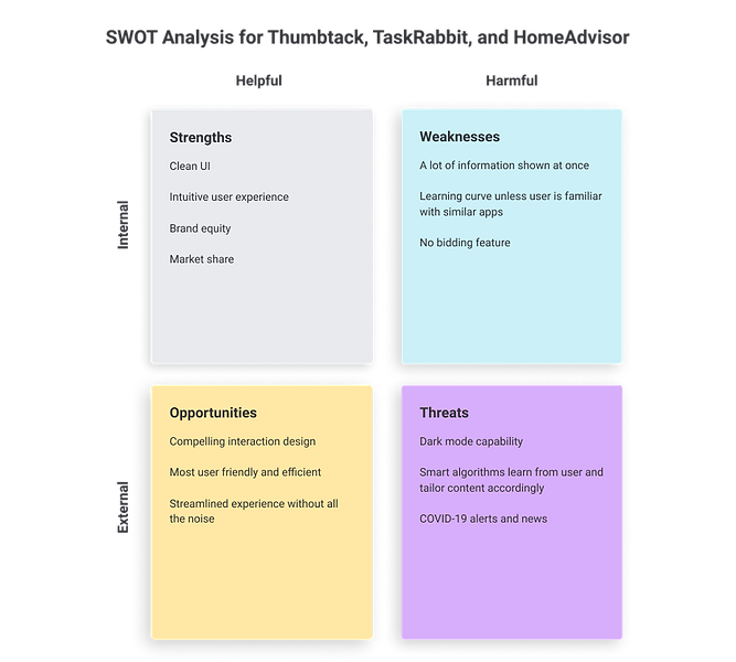
Key Findings
-
Too many features can be confusing for the average user
-
Too much information may disrupt the user flows
-
Biddy has an opportunity for positioning itself as the most user-friendly and streamlined home improvement app
How Might We?
HMW Charts allowed us to list potential problems during the design sprint and reframe them as opportunities.
We listed our main roadblocks and identified the top three to focus on according to our users' needs and business requirements.

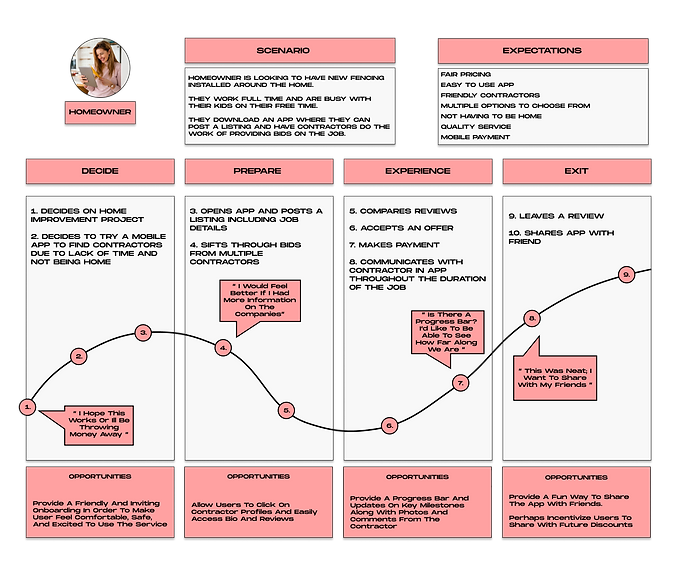
Journey Mapping
We then designed some journey maps to further visualize any and all touchpoints our users may encounter.
By applying empathy to each of the phases of their experience, we asked ourselves what could be better designed in order to facilitate the overall experience and make the app more engaging through that journey.

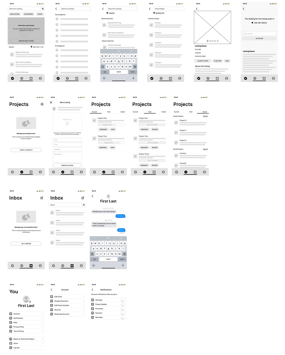
Sketching
Exploring, ideating, and refining potential solutions.


User Testing
Once our prototype was designed, we moved into the testing phase. This was an important step as it allowed us to test our design assumptions and catch any usability errors in real-time.
The results of the five user tests we conducted are summarized below.

Key Findings From User Testing:
1.
Call to action inside hero card was not generating clicks
Suggestion: Make visual hierarchy stronger through color
2.
Bidding screen elements were not obvious
Suggestion: Create dominance in key information
3.
Icons in bottom navigation were causing confusion
Suggestion: A/B test icons on users
Branding & Styling
Conclusion
Outcomes
-
After extensive prototyping and testing we understand our users’ needs, goals, and motivations
-
Achieved a working MVP to facilitate the modern home improvement project
Lessons
-
Creating a strong visual hierarchy is crucial in guiding the user through their journey
-
User testing is vital at every step of the design process because they test our assumptions as designers
-
Consistency in iconography and elements across the app are important in building trust with the user
Recommendations for Biddy 2.0
-
Conduct an A/B test for a visual design direction that is more aligned with our product’s story
-
Establish intuitive interactions that are validated by user data
-
Incorporate imagery and original icons for personality and brand presence
-
Conduct further research for other possible use cases
